How to Choose a Color Scheme For Your Website
Color is often seen as having a mystical presence in web design: Far and away from the nit-pickiness of margins and image resolutions, choosing a color scheme seems to bring out a burst of creativity in even the most data-driven team member. Colors, after all, carry plenty of symbolic weight. Posts abound about the “language” and “meaning” of color, but at the end of the day, there is no golden rule book on how to choose the right color scheme for your website. Even so, we’ve compiled a list of helpful tips and tools to get you through this important hurdle in your design.
It’s time to get colorful.
1. Stop Trying to Find Meaning in Color
Plenty of resources exist online with the soul purpose of matching customer feelings to color schemes: Brown means “seriousness”, but it also gives off connotations of “earthiness”; green shows “energy”, but also “tranquility”; purple is linked to “spirituality” as much as it is “luxury”.
The bottom line: choosing a color scheme based on its supposed psychological or cultural meaning alone is a pretty perilous path to take.
Sure, there are obvious cases in which colors can be linked to the content they surround (a website with an environmental focus probably won’t choose a black and pink color scheme, for example) – but even when aligning content to a specific color seems obvious, it may only be the easiest road to take.
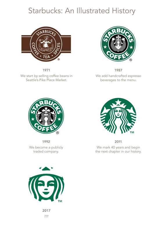
Take the iconic Starbucks logo: Back when they were a fledgling coffee shop in Seattle, the early Starbucks logo was brown. In 1987, everything changed: The double-finned siren became green when they merged with the espresso company Il Giornale, and the rest is logo history. Tradition was swept under the carpet, and a legend was born.
When choosing a color scheme for your website, don’t be afraid to cross lines and think outside of the box. Sometimes, a color with a seemingly opposite connotation will be just the thing to brighten up an otherwise dull page.
2. Know Your Color Wheel
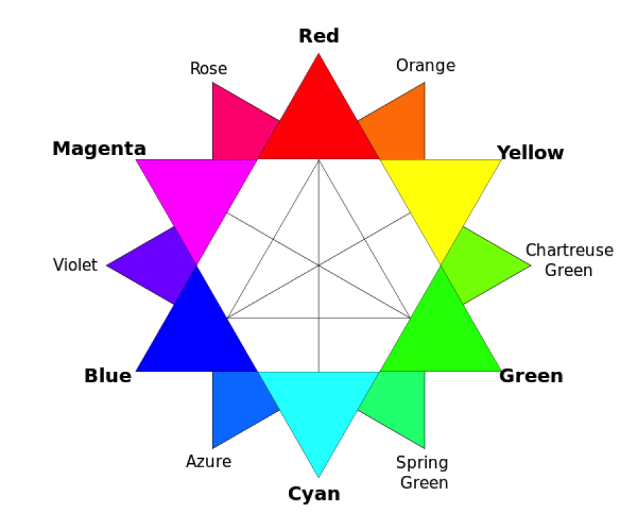
You’ve seen a color wheel before: it’s that circular rainbow tacked to the wall of just about any classroom wall. On RGB (red/green/blue) and CMY (cyan/magenta/yellow) wheels (which are most widely used in web design) colors are divided into different categories: primaries, secondaries, tertiaries, and complementaries.
- Primary colors are red, green, and blue.
- Secondary colors are cyan, magenta, and yellow, and are made when two primary colors are mixed.
- Tertiary colors like orange and violet come in when a primary color is mixed with a secondary color, or when two secondary colors are mixed.
- Complementary colors are colors that, when placed next to each other, produce the highest contrast (and impact). A color wheel simplifies complementary colors by placing them directly across the wheel from each other: Blue’s complentary color is yellow, while green’s complementary color is orange.
Using complementary colors as the basis for your web design is common sense: The human eye will differentiate content more easily if opposing colors are used to describe different bits of content, and the results will be pleasing to the eyes.
But beware: Strictly speaking, using primary colors on your website is usually too hard on the eyes at first glance. Venture into the world of tertiary colors instead, where shades become subtler, and where complementary colors won’t look jarring next to each other.
3. Stay Minimal
One of the biggest rookie mistakes in choosing a great color scheme for your website is to get carried away: a two-color scheme suddenly becomes a ten-color scheme, or color is used so pervasively that a user has to rub their eyes to navigate a page. The key to color in web design is to stay simple: Stick to a white or neutral background, and use color as an accent to draw attention to the right places.
Consider, for example, using color for text only when a mouse scrolls over the content, or using a splash of color to highlight a call to action button in front of a clean background. Remember: Color can easily become overwhelming for human eyes.
4. Images are colorful, too
This may sound like an obvious one, but neglecting to consider the colorfullness of the images on your website is another common mistake.
If you are designing an image-heavy site, for example, consider using a mostly monochrome or grayscale background, and letting the images act as a much-needed splash of color. One website that does this particularly well is the brilliantly designed Airbnb, whose business is built on big, crisp, images of places to rent. Images appear especially vibrant when placed against their simple background, while color-coded text makes it simple to read messages, postings, and reviews.
5. Take a Look at your competitors
Even though you don’t need to worry about aligning your color scheme to emotions, it can be helpful to take a close look at the leaders in your field – as well as your competitors – to get an idea of the color schemes they are picking.
This, we’re afraid to say, has a lot to do with going with the grain. Certain industries tend to stick to a certain scheme, and aligning your web design with this scheme can help your audience to visually identify with the industry you yourself want to identify with. Fashion is, of course, one such example. Ever since Coco Chanel brought the elegance of monochrome to the world, the fashion world has been in love with the cool edginess and understated glamour of black and white. Apps and tech startups, meanwhile (from Facebook to Twitter), seem to love the friendly vibe that sky blue gives off.
The Only Golden Rule is That There Are No Golden Rules
Designers and marketers alike have a penchant for falling into miracle solutions and solve-everything solutions, but the simple reality of web design is that the only way to get your web site’s color scheme right is to try, test, and try again. Websites, after all, aren’t carved in stone, and can be modified and tweaked till they reach the perfect balance.
Image Credits:
Starbucks logo evolution by Damien du toit
Summer Harvests by mike65444
Color Wheel uploaded by Magnus Manske to Wikipedia Commons.
Most Recommended Articles:
About
Erez is an experienced web designer and also the founder of website-builder.com. He writes for dizyne.net and IM Now.


liuzhy
Thank you, even I am not a designer.