How To Choose Website Typography
The web is a text-based environment; good typography can make or break a website. And yet, website typography is still, for the most part, an intuitive art. While big data has been slowly seeping into the world of web design in recent years, choosing the right font for a website remains just a little bit mystical – the result of painstaking comparisons and tweaks.
For those of us who didn’t spend four years in design school, choosing fonts and spacing text may not come naturally. With this in mind, here is a helpful guide to choosing the right typography for your website.
Glossary: Typography is a term to describe the way in which letters are styled and arranged in order to make them the most readable and visually appealing. Typography encompasses decisions relating to fonts and typefaces, sizing, font pairing, leading, spacing, and weights.
Typefaces and Fonts
Sure, there might be 10’s of thousands of sexy and weird typefaces out there, but generally speaking, the web tends to prefer simple, universally recognized typefaces.
There are two reasons for this:
-
It’s difficult (if not impossible) to maintain control of your website across all browsers and devices, so choosing a universally recognized typeface, such as Arial, Verdana, Helvetica, or Times New Roman, relieves much of the stress of pouring your hard work into a design only to find that it looks totally different on another computer.
-
Your job as a designer is to make your website as readable as possible. Even the best copy can be lost in the muck if its spacing or size is wrong.
Most web fonts can be divided into two categories, Serif and Sans Serif:
-
Serif letters contain small embellishments at the end stroke of a letter
-
Sans Serif letters (sans meaning “without” in French) don’t contain any extra features.
Glossary: A typeface (also known as a font family) is a collection of fonts. Fonts are all the individual ornamentations, slants, weights, and widths that might come with a typeface.
Pairing
Most designers will choose at least two typefaces to work with for a website, for the simple reason that two styles help differentiate content to make it more readable. There are no golden rules when it comes to pairing typefaces; the best approach is still to try, try, and try again.
There are, however, a number of online tools that make comparing typefaces and setting them for your website much, much easier. Here are two of our favourites:
-
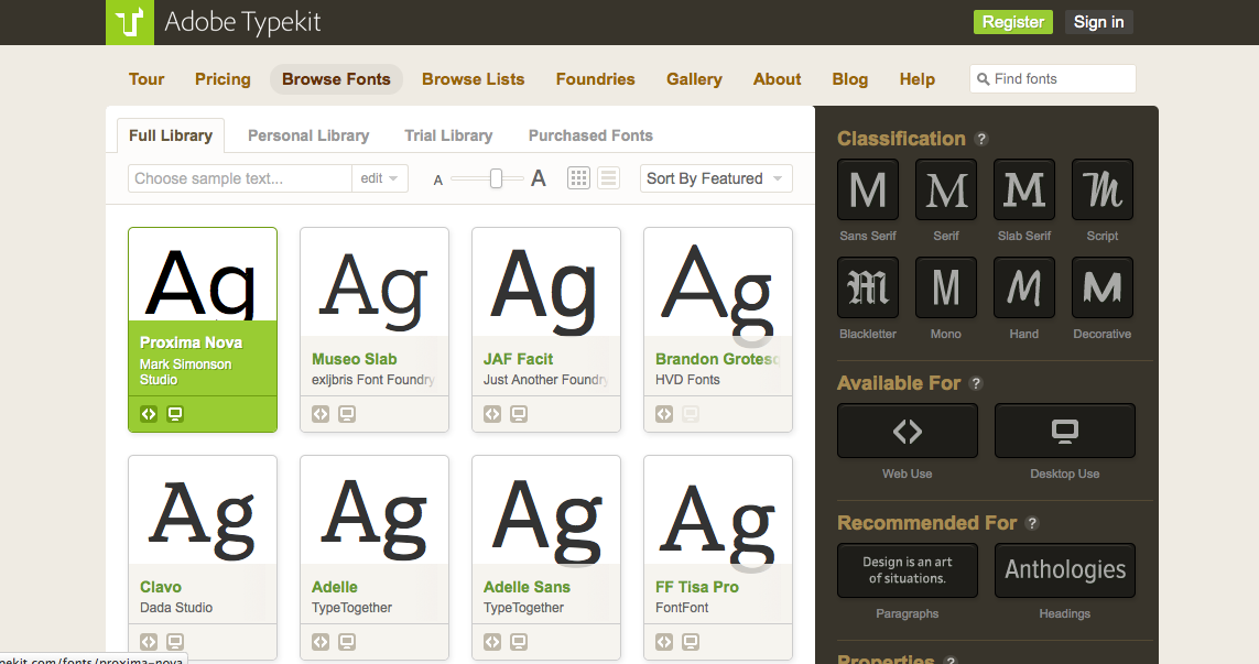
Typekit, run by Adobe, is an enormous font library with a filter system built to help you find the right typeface for all contexts. Typefaces can be filtered by weights and sizes, the platform they’re best suited for, and the context they’re most readable in. Typekit’s full font library is available for $49.99 per year, but if you aren’t a professional or just want to play around, they also offer a free version that provides you with 800+ web fonts to use on one website.
Typekit also host a great blog, and have contributed some useful articles on choosing typefaces for your website. Check out this article by Typekit in Creative Bloq for more tips and tools.
-
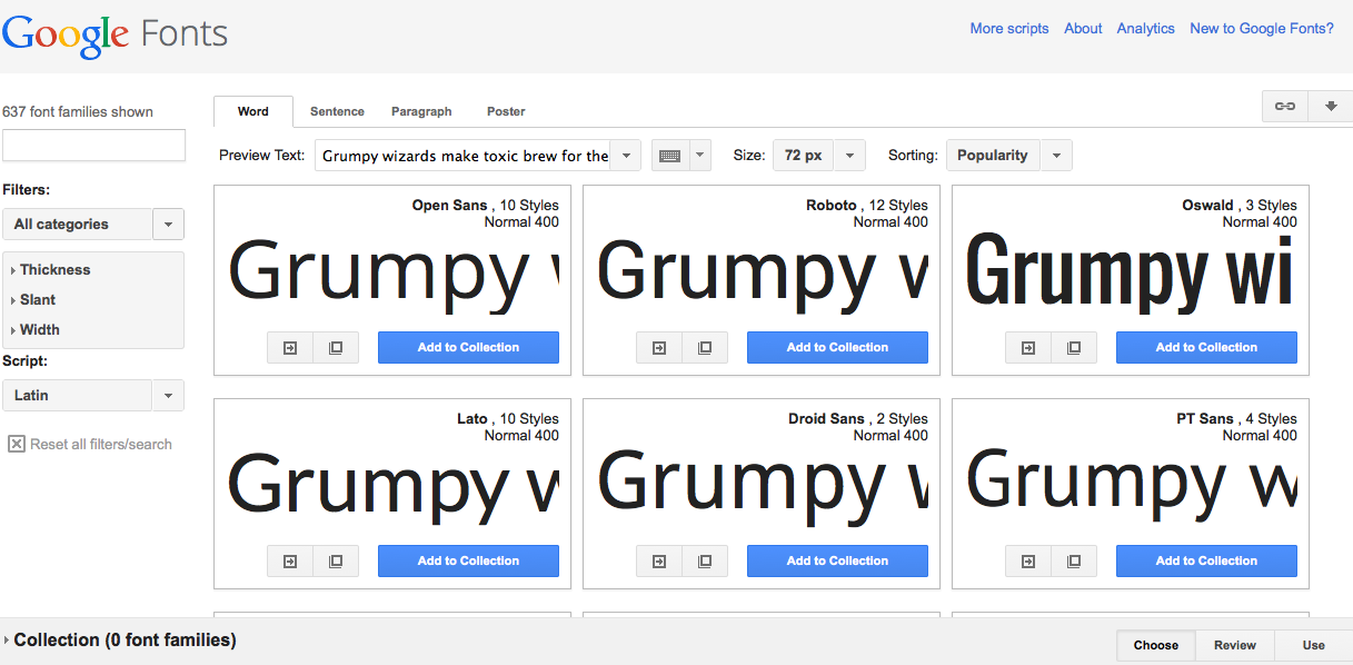
Google Fonts offer a slightly more bare-boned approach to font libraries, but their free resource is useful for comparing and contrasting different fonts as they will work in different contexts. As with all things Google, Google Fonts syncs effortlessly with other Google apps.
Colour, Size and Weight, Leading and Tracking
Choosing the right typography doesn’t stop at fonts. In order to perfect the readability of your site’s text-based content, you’ll need to play around with font colours, sizes, and weights, as well as how the letters and bodies of text are spaced through leading and tracking. Playing with these elements also helps to establish a hierarchy amongst your text-based elements: important elements like titles or quotes can be given more importance than your body text simply by adjusting small aspects of your typeface.
-
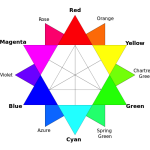
Colour: Colour seems to strike fear in many designers, with results oscillating between a reluctant grayscale and an all out technicolour dream coat. The best web designers know that colour is a precious resource not to be trifled with, especially when it comes to creating visual contrast. Black on white or white on black text is (and always will be) considered the most readable combination of text colours, but if you want to play around with colour, think about contrast more than the mood you want to set.

-
Size: Most websites set the size of their text bodies at around 14px, which provides the most economy of space along with good readability. Titles and headers, of course, are a different story. Titles can take up the whole page if you want them to, but keep in mind that bigger doesn’t necessarily mean more visible. Human visual attention is dictated by the contrast and space around areas, not by how big the area is.
-
Weight: A font’s weight is often a good way of differentiating pieces of textual content on your website. The “heavier” the font, the more important it tends to be.
-
Leading: Leading refers to the space between two lines of text, and can make a huge difference when it comes to the readability of a body of text. According to Max Luzuriaga at tuts+, 1.5 the size of your text is the best leading for large bodies of text. Max has a great article on choosing typography that you can check out here.
-
Tracking: Tracking refers to the space between two letters or characters, and is yet another way to increase readability on your website. Once again, Max Luzuriaga at tuts+ has a great tip when it comes to tracking:
“Another place it would be beneficial to add tracking to is small-caps. Here it’s generally considered good practice to add an extra pixel or two between the characters, as they naturally appear larger.” (Choosing the Right Font: A Practical Guide to Typography on the Web, 4 November 2011)
Test, Test, Test again
With so many elements to experiment with, choosing typography for your website may seem like a daunting process but really, it’s best to think of it as among the more playful aspects of building a website. The best way to find the right combination for your website is to experiment, test, and play.

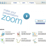
One great resource for typographic experimentation is the in-browser typography designer TypeCast. TypeCast has a dizzying number of features, including typography customization and decorative effects, project-wide changes (removing the need for you to change the weight of each header in your project one at a time), flexible layout creation, and much more. TypeCast also has a great mobile app, which allows you to test out designs right on your mobile device. Typecast is free to try, and comes with a great help resource to get started.
Image Credits:
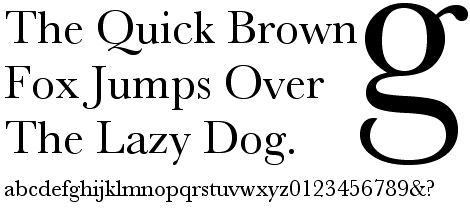
Baskerville Sample uploaded to Wiki Commons by Rivertorch


About Bee Kay
Bee Kay is an artist and writer with a knack for writing about the intersections between web design and everyday life.


Leave Comment
Error